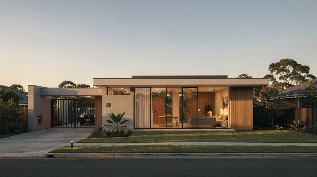
A contemporary residence can look simple on paper and still carry a surprising amount of visual and emotional depth on screen. In this project spotlight, the goal was not to “show the house,” but to build a short documentary that reveals how the architecture works, how the light moves through it, and how the home feels when lived in.
The best architectural films do more than document finishes and floor plans. They translate space into rhythm, texture, and atmosphere. That is especially important for contemporary residences, where restraint, clean lines, and open plans can easily flatten into generic footage if the film does not have a clear point of view. Over years of shooting properties, I’ve learned that minimalism is the hardest thing to film well — because there’s nothing to hide behind. Every camera decision either honors the design or betrays it.
Why this project was different from a standard real estate video
Most real estate films are built to sell quickly. A documentary-style residence film is built to be remembered. The difference is not just runtime; it is intent. When you shoot a property for a listing, you’re working with a checklist. When you shoot it as a documentary, you’re working with a thesis.
A standard property video usually prioritizes:
- Fast coverage of every room
- Broad appeal
- Clear marketing messaging
- Short runtime for listings and social media
A documentary approach prioritizes:
- Narrative structure
- Visual continuity
- Architectural intent
- A stronger sense of place
For this project, the residence was treated as a subject with its own story, not just a product to be advertised. That shift changes every creative decision, from how scenes are ordered to how the camera moves through the home. For instance, instead of starting with the kitchen because it’s the selling point, we started with the approach path — the gravel underfoot, the shadow line of the cantilever, the sound of the door before anyone steps inside. These are choices that don’t fit a listing template, but they build a world for the viewer.
The creative brief: what the film needed to communicate
The project centered on a contemporary residence with a strong relationship between architecture, interior light, and daily use. The film needed to communicate three things clearly:
- How the home is organized spatially
- How natural light shapes the interior experience
- How design choices support a calm, modern way of living
That meant the film could not rely only on wide establishing shots. It needed a balance of:
- Room-to-room transitions
- Detail work
- Human scale
- Moments of stillness
In other words, the house had to feel inhabited, even when no one was on screen. Achieving that meant studying the light at different times of day, noticing the way a particular chair catches the morning sun, or how the hallway compresses before opening into the living volume. These observations became the raw material for the edit.
How the story was built
A documentary about a residence still needs structure. Without it, the film becomes a sequence of pretty shots with no momentum. Architectural spaces don’t narrate themselves — the filmmaker has to find the arcs within the geometry.
1. Start with arrival
The opening sequence established context before moving inside. Exterior shots were used to introduce:
- The home’s massing
- Its relationship to the site
- The way it sits in the landscape
This is where pacing matters. If the opening is too fast, the viewer never settles into the architecture. If it is too slow, the film loses energy. The solution was to let the first few shots breathe while still guiding the viewer toward the main story. A slow push through foreground foliage, a held frame on the façade with shifting cloud reflections, a subtle rack focus from the entry path to the door handle — each shot earns its screen time by building anticipation.
2. Move from public to private spaces
The interior sequence followed a natural progression:
- Entry
- Main living areas
- Transitional spaces
- Private rooms
- Detail-driven moments
This mirrors how a person experiences the home in real life. It also gives the film a built-in sense of progression. A viewer should feel that they are moving deeper into the residence, not just bouncing between unrelated shots. We paid special attention to thresholds — hallways, door openings, and changes in ceiling height — using them as breathing points between the larger spaces. These in-between moments are where the rhythm lives.
3. End with a feeling, not a floor plan
The closing images focused less on coverage and more on atmosphere. Instead of simply ending on the most obvious hero room, the final sequence emphasized:
- Light falling across surfaces
- Quiet corners
- Framing through doorways
- Subtle movement in the space
That kind of ending gives the film emotional aftertaste. The viewer may not remember every room, but they remember how the home felt. We closed on a slow dolly through the main living area toward a window, with sheer curtains barely moving and the afternoon light dragging across a concrete floor. No dramatic reveal — just texture, warmth, and resolution.
Cinematography choices that made the home feel dimensional
Contemporary interiors can look flat if the lighting and camera movement are too controlled in a sterile way. The challenge is to preserve the clean design while adding visual depth. Sterile crispness is the enemy of atmosphere — you need shadow, texture, and imperfection to make a frame breathe.
Lighting for interiors
Natural light was the foundation of the look, but natural light alone is rarely enough. Interiors often need shaping to avoid dead zones, especially in deeper rooms or spaces with large bright windows. A common scenario: a south-facing wall of glass that blows out while the kitchen island falls into murky shadow. That’s not contrast — that’s imbalance.
A practical lighting approach for a residence like this usually includes:
- Exposing carefully for the windowed areas
- Using supplemental light only where needed
- Preserving contrast so the home does not look overlit
- Keeping practical fixtures motivated within the frame
The biggest mistake in contemporary home films is flattening everything to the same brightness level. That may make the space easier to “see,” but it removes mood and texture. I often work with bounced or diffused fixtures tucked behind furniture, never visible, just lifting the ambient level enough to let the eye travel naturally from bright to dark zones. A subtle gradient of light across a wall tells a better story than flat, shadowless illumination.
Camera movement in tight spaces
Modern residences often combine openness with narrow transitions, hallway turns, or compact secondary rooms. Those spaces demand camera movement that feels intentional, not decorative. In a vestibule or powder room, even a small gimbal correction can feel like seasickness — better to lock off and let the composition hold.
Useful movement principles included:
- Slow, controlled push-ins for revealing depth
- Gentle lateral moves to show spatial connections
- Minimal rotation in tight interiors to avoid disorientation
- Holding still when the architecture already provides strong composition
The camera should never fight the room. In a compact space, less movement often creates more elegance. For one hallway transition, we used a slider at walking speed to reveal the next space gradually — almost like a slow exhale. That restraint kept the viewer’s attention on the architecture, not the technique.
Framing to show scale
One of the most important tasks in architectural film is communicating scale without exaggeration. That was handled by mixing:
- Wide shots that define the room
- Medium compositions that show circulation
- Close details that reveal material quality
This combination helps the viewer understand both the whole and the parts. Without detail shots, a residence can feel generic. Without wider context, the details lose meaning. I think of it as a scale ladder: each frame steps the viewer up or down in spatial understanding, so by the end of the sequence they’ve mentally built the house in their head.
Visual elements that strengthened the documentary feel
A documentary-style residence film benefits from observational moments that feel less staged and more discovered. These are the shots that make the viewer feel like a guest rather than a shopper.
Detail shots
Details were used to anchor the film in material reality. These included:
- Door hardware
- Trim transitions
- Cabinet surfaces
- Texture in stone, wood, or plaster
- Reflections and shadow lines
These shots do more than fill time. They tell the viewer that the film is paying attention to craftsmanship. A macro detail of a cast-concrete wall, rack-focused from the aggregate to the smooth edge, communicates materiality more honestly than any wide shot ever could. Those few seconds of texture often become the moments viewers remember most.
Sound and pacing
Even when a film is primarily visual, sound helps define its tone. Quiet room tone, subtle ambient sounds, and restrained music can support a more reflective pace. In the edit, we used the hum of the ventilation and distant birdsong not as noise, but as atmosphere — a sonic texture that matched the visual stillness.
For a contemporary residence, overly dramatic music can work against the architecture. A stronger choice is usually something understated that supports the visuals instead of overpowering them. Think ambient beds with modal shifts rather than sweeping orchestral arcs — the music should feel like another material in the space, not an emotional overlay.
Human presence
If a residence film includes people, the best use of them is often indirect:
- Hands opening a door
- Someone crossing a room
- A seated moment near a window
- Everyday interaction with the space
These gestures make the home feel livable without turning the film into a lifestyle ad. We filmed a single hand trailing along a plaster wall, blurred in the foreground, with the living room sharp behind it. That moment wasn’t about a person — it was about tactility, scale, and the relationship between body and surface.
Common mistakes to avoid in a project like this
A documentary about a contemporary residence can go wrong in predictable ways. The most common problems are not technical; they are editorial. Over the years, I’ve seen (and made) most of these, and they all stem from the same root: treating the house as a subject to be catalogued rather than a story to be told.
| Mistake | Why it hurts the film | Better approach |
|---|---|---|
| Showing every room in the same way | Creates visual repetition | Vary framing, pacing, and shot purpose |
| Overusing fast camera movement | Makes the space feel smaller and less elegant | Use slower movement and stronger compositions |
| Ignoring transitions | Breaks the sense of journey | Film hallways, thresholds, and sightlines |
| Flattening the light | Removes mood and architectural depth | Preserve contrast and natural directionality |
| Treating details as filler | Weakens the narrative | Use details to support the home’s identity |
| Ending with a random hero shot | Feels generic | Close on a visual idea that completes the story |
A simple production workflow for a residence documentary
A strong architectural documentary is easier to make when the production plan is clear from the start. Improvisation on set is valuable, but without a structural plan, you risk missing the shots that tie everything together.
Pre-production checklist
- Walk the property at the intended shooting time
- Identify the rooms with the best natural light
- Mark the strongest sightlines and transitions
- Decide which spaces need coverage, detail, and atmosphere
- Confirm whether the film is meant for marketing, brand storytelling, or editorial use
Shooting order
- Exterior establishing shots
- Main interior spaces
- Secondary rooms and circulation areas
- Detail sequences
- Closing mood shots
Editorial priorities
- Build a clear beginning, middle, and end
- Alternate wide shots with closer moments
- Avoid repeating similar compositions back to back
- Keep transitions smooth and logical
- Remove anything that adds coverage but not meaning
What this project teaches about filming contemporary architecture
Contemporary architecture often looks effortless. On camera, that can be deceptive. Clean lines and open plans only work when the film understands how to reveal them. I’ve walked onto sites where everything looks stunning to the eye, only to find the viewfinder telling a different story — flat planes, no depth, geometry dissolving into white noise. The gap between experience and image is where cinematographic skill lives.
The key lesson from this project is simple: the space itself is the story, but the story still needs direction. A residence becomes more cinematic when the film respects how the home is entered, crossed, paused in, and experienced over time. It’s not enough to point the camera at beautiful things — you have to sequence them so the beauty accumulates meaning.
That is why documentary-style architectural filmmaking works so well for contemporary homes. It gives the viewer more than a visual tour. It creates a sense of being inside the design.
Practical takeaways for your next architectural film
If you are planning a similar project, keep these principles in mind:
- Build the film around spatial experience, not just coverage
- Use light to reveal mood and depth
- Let transitions connect the rooms
- Include enough detail to show craftsmanship
- Edit for rhythm, not just completeness
- Treat the home as a character with structure and atmosphere
FAQ
What makes a documentary film different from a real estate video?
A documentary film focuses on story, atmosphere, and architectural intent, while a real estate video usually focuses on fast, efficient property presentation. The documentary asks “what does this space feel like?” rather than “what does this space look like?”
How long should a documentary-style residence film be?
There is no fixed length, but documentary-driven residence films usually need more time than standard listing videos because they rely on pacing and narrative structure. Most of my projects in this style land between three and seven minutes — enough to establish, explore, and resolve without losing the viewer’s attention.
Do contemporary homes need interviews in architectural films?
Not always. Interviews can add context, but many strong residence films work without them if the visuals and edit already communicate the story clearly. A well-composed sequence of light moving across a room can say more about the home than a voiceover explaining the architect’s intent.
What is the most important thing to capture in a contemporary residence?
The relationship between space, light, and movement. If those three elements are clear, the film will feel coherent and cinematic. Everything else — finishes, furniture, fixtures — serves that triad.
Can a small home still work as a documentary subject?
Yes. In fact, smaller homes often benefit from documentary treatment because thoughtful framing can reveal character that standard coverage would miss. Compact spaces force you to be more intentional with every shot, and that discipline usually produces better work.
Conclusion
A contemporary residence may appear minimal, but the right film can uncover a rich visual narrative inside that restraint. By combining architectural observation, careful lighting, purposeful movement, and a clear editorial arc, a documentary film can turn a home into a memorable cinematic experience.
For creators working in architectural and real estate cinematography, that is the real opportunity: not just to show spaces, but to help viewers understand what it feels like to live within them.