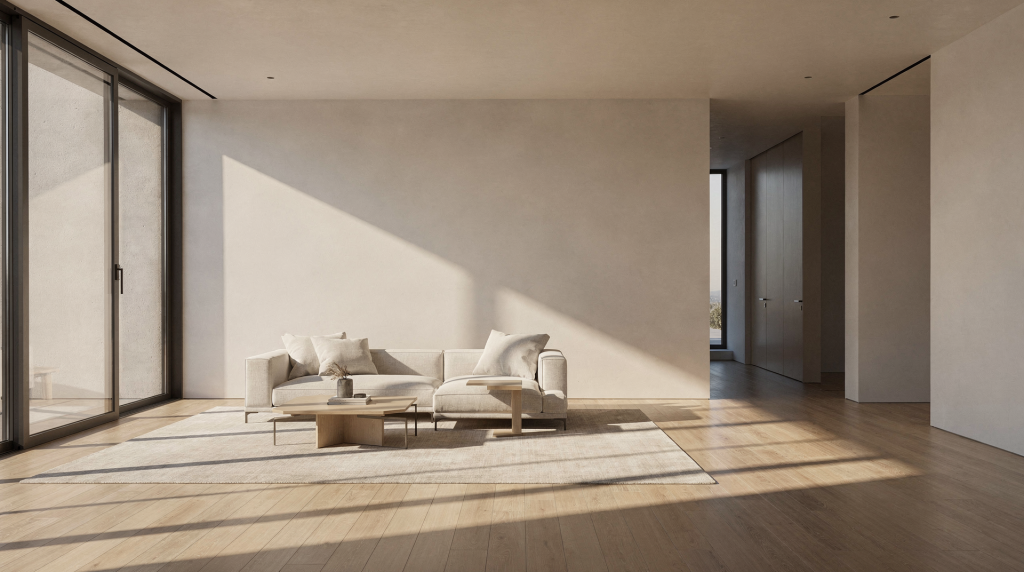
Light is the fastest way to make an interior breathe on camera. It doesn’t just illuminate – it carves depth, exposes the true texture of materials, and guides the viewer’s eye through a space without a single word. Over a decade of shooting architecture, I’ve learned that the real job isn’t to “brighten the room.” The real job is to shape how a room feels – open, intimate, elegant, calm, dramatic, or purely functional. And that means understanding how natural daylight, existing fixtures, and controlled artificial sources interlock inside a frame.
Why light matters in interior architecture
Interiors are built to be experienced in three dimensions, but a camera flattens everything into a two‑dimensional image. Light restores that missing volume. It separates the foreground from the background, reveals the exact edge where a hallway turns, and gives surfaces – wood grain, plaster, stone, glass – a visible, almost tactile character.
There’s also the everyday technical headache: windows are almost always far brighter than the room itself. Leave that contrast unmanaged and the interior turns muddy, flat, or overexposed. Good lighting planning solves this before you even hit record.
What cinematic lighting does in interiors
- Reveals the true shape of the room
- Adds depth and spatial separation
- Preserves detail in window views
- Brings out texture in every surface
- Makes the viewer feel the room’s mood
- Helps a space read as intentional, not accidental
Start with the room, not the gear
Before you switch on a single light, read what the room is already doing. Architecture gives you the lighting story; your job is to translate it clearly. I always walk the space slowly, looking for the natural flow of light and shadow.
Pay attention to:
- Window orientation and size
- Time of day – the same room at 8 am and 4 pm can look like two different properties
- Wall color and reflectivity – dark walls eat light, white walls throw it around
- Ceiling height – high ceilings can pull the eye upward if lit, or feel cavernous if ignored
- Surface texture – smooth, rough, matte, glossy
- Existing practical lights – lamps, sconces, built‑in fixtures
- Dark corners and cluttered zones that soak up light
- Whether the space feels best in morning cross‑light, midday toplight, or late‑afternoon gold
A south‑facing living room with floor‑to‑ceiling windows behaves completely differently from a narrow interior hallway or a basement media room. The first likely needs control more than supplementation. The second may force you to build the entire light environment from scratch.
Natural light: the strongest design element in the room
In most interiors, daylight should be your foundation. It’s the most believable light source because it already belongs to the architecture. Open curtains, raise blinds, and decide whether the room shines with direct sun, soft overcast, or filtered window light. I often spend the first few minutes on location simply observing how the daylight moves across the floor and walls before I place a single stand.
When natural light works best
- Rooms with generous windows
- Interiors where the exterior view is a feature, not a distraction
- Spaces with materials that love soft sidelight – think plaster walls, matte wood, textured stone
- Homes where openness and warmth are part of the selling narrative
When to control natural light
- When windows blow out and dominate the frame
- When direct sun creates harsh, unflattering hot‑spots
- When mixed daylight through different openings causes awkward color shifts
- When the front of the room is bright but the back falls into darkness
If the sun is simply too aggressive, diffusion is your closest ally. Sheer curtains, a roll of diffusion fabric clipped to a stand, or even the patience to wait for a cloud can transform the scene. Soft light almost always flatters architecture better than hard sunlight – it reveals form without exaggerating contrast to the point of distraction.
Balancing windows and interior exposure
Dynamic range is the daily battle of interior filmmaking. The sensor has to hold detail in both the bright exterior and the darker room. Expose for the window and the interior can drop into murk. Expose for the room and the outside burns to white.
My rule of thumb: decide what matters most in the shot.
- If the vista is a key selling point, protect the window.
- If the room itself is the hero, defend the interior tonality first.
- If both must read clearly, reduce the contrast with controlled lighting and careful timing.
Simple ways to balance the scene
- Shoot when exterior light is softer – early morning, late afternoon, or overcast days
- Use diffused artificial light inside to lift the shadow side
- Turn on practicals to add localized brightness that feels organic
- Avoid rooms where the window is drastically brighter than the interior unless you have the tools to manage the contrast
- Make small exposure adjustments room by room instead of forcing one flat setting across the whole property
Practical lighting: the secret weapon of interior video
Practicals are the visible fixtures – table lamps, wall sconces, pendants, ceiling lights. When used with care, they do more than illuminate: they make a space feel inhabited. I treat practicals as a shortcut to warmth and dimensionality. A single lamp in the corner of a living room can do the work of a whole soft fill panel, and it’s already part of the design.
How to use practicals effectively
- Turn on only the fixtures that support the mood – less is often more
- Replace mismatched bulbs if color temperatures clash loudly (a 2700K lamp next to a 4000K downlight is a recipe for ugly mixed light)
- Use lamps to create pools of warmth that anchor seating areas or define zones
- Avoid overly green or blue bulbs unless the space genuinely calls for that – cheap LEDs can ruin a scene
- Check for flicker before rolling, especially with dimmers or budget bulbs
In real estate and architectural video, practicals are precious because they add depth without screaming “production lighting.” The viewer feels the room, not the gear.
Artificial light: support, don’t overpower
Artificial light in interiors should almost always support the existing environment, not replace it. A room that feels naturally lit will almost always read better on screen than one that feels heavily manufactured. I aim for a look where the audience can’t tell I’ve added anything.
The best artificial sources for spaces are soft, movable, and easy to blend with what’s already there. Think in terms of shaping shadows and gently lifting dark areas – not flooding the room with brute output.
Good uses for artificial light in interiors
- Opening up a dark corner that would otherwise pull the eye away from the hero composition
- Softening the contrast between the window side and the room’s interior
- Adding definition to a hallway, entry, or threshold
- Bringing out the texture in brick, tile, wood grain, or honed stone
- Helping a room read consistently as you move from one camera angle to the next
What to avoid
- Hard shadows that feel unrelated to any visible source in the room
- Bright fixtures that create distracting hot spots on furniture or walls
- Lighting that flattens all depth and dimension
- Overusing cool light in a warm interior – it can feel clinical and detached
- Mixing too many color temperatures without a clear, motivated reason
A simple workflow for lighting interior architecture
Cinematic doesn’t mean complicated. With a repeatable process you can walk into any space and know where to start. Here’s the sequence I use on almost every shoot.
Step 1: Evaluate the room
Walk the space and identify the brightest and darkest areas. Notice where your eye goes naturally – that’s often where the light already leads.
Step 2: Choose the hero angle
Decide which camera angle best communicates the room’s design intent. Light for that view first; the rest can be adjusted later.
Step 3: Open up the natural light
Adjust curtains, blinds, and doors. Let the room show you its natural baseline before you add anything.
Step 4: Turn on practicals
Add warmth and realism where needed – a couple of well‑placed lamps can shift the entire atmosphere.
Step 5: Fill only what is necessary
Use artificial light sparingly to lift shadowed zones or restore balance. If you can’t see the problem clearly in the frame, you probably don’t need more light.
Step 6: Check the frame for problems
Scan for glare, reflections in glass or mirrors, color mismatches, and dead dark corners that suck depth out of the image.
Step 7: Record a test clip
Review on a larger monitor if possible. What looks minor on a 5‑inch screen can become a glaring issue once you play it back at full size.
Room-by-room lighting strategy
Every room carries its own purpose and architecture. A one‑size‑fits‑all lighting approach usually fails because it ignores the individual rhythm of each space. Below is a field‑tested breakdown I rely on when moving through a property.
| Room type | Lighting goal | Common challenge | Best approach |
|---|---|---|---|
| Living room | Warm, spacious, inviting | Window contrast and mixed practicals | Use daylight as base, add soft fill, keep lamps on for depth |
| Kitchen | Clean, balanced, detailed | Reflective surfaces and ceiling fixtures | Control glare, use even soft light, watch white balance carefully |
| Bathroom | Bright but flattering | Limited window light, harsh mirrors | Use soft sources and manage reflections with flagging or angle changes |
| Hallway | Depth and direction | Narrow space, weak natural light | Create layers and shape with subtle edge or top fill |
| Bedroom | Calm, intimate, soft | Flat top light, dark corners | Lower overall contrast, lean on warm practicals for mood |
| Stairwell | Drama and movement | Uneven light falloff | Use directional light to emphasize lines, steps, and structural rhythm |
How to reveal texture, not just brightness
Architecture comes alive when the viewer can almost feel the surface through the image. Texture is revealed by the direction of light. Flat, head‑on lighting erases it. If I want a wall to read as tactile, I’ll place a source so it grazes the surface at an acute angle – the tiny shadows that result define every ridge and grain.
Materials that benefit from directional light
- Brick
- Concrete
- Wood grain
- Linen and fabric
- Stone
- Plaster
- Ribbed or fluted surfaces
A grazed brick wall in side‑light tells a completely different story than the same wall lit straight on. The latter can look like a flat texture map, while the former reveals its weight and history.
A useful rule of thumb
- Front light = clearer exposure, less texture
- Side light = more depth and surface detail
- Backlight = separation and atmospheric glow
- Top light = can feel flat and sterile unless it is part of the room’s natural architectural design
Color temperature: keeping the room believable
Nothing pulls an interior out of reality faster than a careless mix of warm lamps, cool daylight, and mismatched LED panels. The result reads messy, amateur, and untrustworthy.
Color temperature is simply how warm or cool the light appears, measured in Kelvin. Warm light (around 2700‑3200K) feels cozy and residential. Cool light (5000‑6500K) can feel clean, but also clinical. The goal is to make the room feel consistent and intentional.
Practical approach
- Match your artificial light to the room’s dominant source – if daylight is the hero, keep fills close to 5000‑5600K
- Keep daylight‑lit rooms feeling natural and un‑forced
- Warm up practicals in living areas where comfort is the emotional goal
- Avoid visible color clashes between window light and interior fixtures – unless that clash is a deliberate design statement
- Set white balance fresh for every room, not once for the whole property. A custom white balance off a grey card in each space saves headaches in post.
Common lighting mistakes in interior architecture video
Even experienced shooters slip into these traps. I’ve made most of them myself at some point, and they can quietly undermine an otherwise strong composition.
Mistake 1: Lighting everything equally
This flattens the room into a boring, dimensionless spread. Real spaces have shadow, depth, and a natural falloff that the eye expects.
Mistake 2: Ignoring the view outside
A bright window without any compensation can ruin the balance. If you don’t plan for it, the exterior becomes a glowing distraction.
Mistake 3: Using too much fill
When shadows disappear entirely, the architecture loses its edges. A room needs contrast to feel three‑dimensional.
Mistake 4: Mixing colors carelessly
Warm lamps and cool LEDs fighting on camera create a color mess that’s hard to fix in post.
Mistake 5: Forgetting reflections
Glass, mirrors, polished countertops, and flat‑screen TVs can all reveal your setup, stands, and even your own movement.
Mistake 6: Lighting the room instead of the shape
Great interior cinematography isn’t about making a space bright; it’s about making its geometry readable. Reveal the volume, not just the surfaces.
A practical pre-shoot checklist
I run through this mental checklist before pressing record on any interior architecture sequence. It keeps me from overlooking the obvious and saves a lot of reshoots.
- Check the direction and quality of natural light – where is it coming from, and how harsh is it?
- Decide the hero angle for each room
- Open or close blinds based on the desired mood
- Turn on only useful practicals; switch off the rest
- Replace or remove mismatched bulbs that could cause color clashes or flicker
- Check mirrors and glass for reflections – flag or reposition as needed
- Test for flicker from LED or fluorescent fixtures, especially on dimmers
- Set white balance intentionally, not automatically
- Review the darkest corner and brightest highlight in the frame – can both hold detail?
- Record a short test clip and watch it back on a proper screen
How to make a space feel cinematic, not staged
Cinematic doesn’t mean artificial. It means the viewer senses intention, rhythm, and atmosphere. That usually comes from restraint. Give the room enough light to tell its story, but not so much that it loses character.
Keep a little shadow in the frame. Let one side of the room feel quieter than the other. Use light to guide the eye toward an architectural detail, a threshold, a material change, or a framed view. The best interiors on camera feel discovered, not manufactured. They invite the viewer to linger.
When to lean into mood over perfect exposure
Not every project asks for bright, spotless coverage. Some spaces – historic homes, boutique hotels, moody lofts, heavily material‑driven interiors – benefit from a more atmospheric approach. Here, shadow is not a defect; it’s part of the design language.
In those cases:
- Let shadows stay in the frame if they add depth and mystery
- Keep a warmer, more intimate color tone if it suits the space’s character
- Prioritize form and feeling over clinical evenness
- Use contrast to emphasize the architecture’s age, texture, and craft
This approach works especially well when the story is about materials, history, or atmosphere rather than square footage. The light should whisper, not shout.
Final takeaways
Light is not an add‑on in interior architecture – it’s a fundamental part of the design language. Handled with care, it reveals the structure of a room, the quality of its materials, and the emotional tone of the space, all within a single frame.
Start with the daylight that already lives in the space. Support it with practicals and soft artificial fill only where necessary. Protect the highlights, preserve texture, and keep the scene believable. That’s what turns a simple walkthrough into a cinematic space.
FAQ
What is the best light for filming interior architecture?
Soft, directional light that preserves depth is usually best. Natural daylight often works as the base, with subtle artificial fill added only when needed. The goal is to make the room feel self‑lit, not overlit.
How do you film interiors with bright windows?
Expose carefully to balance room and window, take advantage of softer exterior light early or late in the day, and use controlled interior lighting to reduce contrast. In extreme cases, clipping the view slightly can be acceptable if the room is the focus.
Should all the lights in a room be turned on?
No. Turn on only the fixtures that support the intended mood. Too many lights can create color problems, hot spots, and visual clutter that steal attention from the architecture.
How do you make a room look more cinematic?
Use shadow, texture, and directional light to build depth. Avoid flattening the space with uniform brightness. Let the light shape the geometry and reveal the character of the materials.
What is the biggest mistake in interior lighting?
Trying to make the room uniformly bright. Good interior lighting shapes the space rather than erasing its natural contrast. The best shots almost always have intentional shadow and a clear sense of light direction.