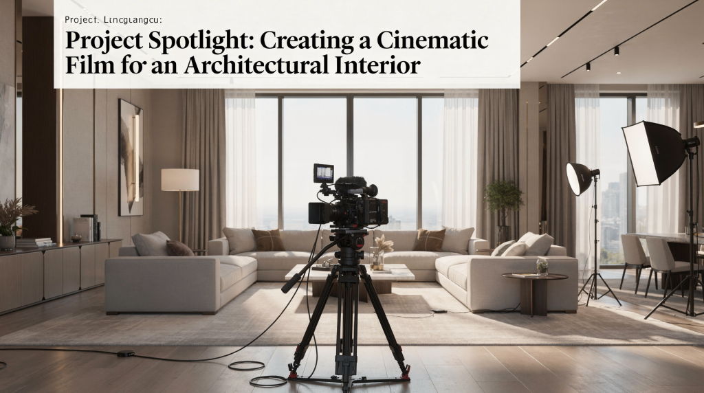
A great architectural interior film does more than show a space — it reveals how that space feels to move through, live in, and remember. In this project spotlight, the goal was to turn an interior into a visual experience with deliberate camera movement, controlled lighting, and a clear narrative arc.
Why this project mattered
Architectural interiors are often filmed like property walkthroughs: room-to-room coverage, a few wide shots, and very little emotional texture. That approach shows scale, but it rarely captures identity. For this film, the brief was to do something more specific: treat the interior as the subject, not the backdrop.
When we reduce a space to a sequence of square-footage checks, we lose the very thing that makes people connect with it — the slow discovery of light across a textured wall, the way a hallway compresses before opening into a double-height living area. Our job was to let those moments breathe. The result depended on three things:
- showing spatial flow instead of isolated rooms
- using light to shape mood and depth
- designing movement that felt intentional, not mechanical
That combination is what makes a cinematic interior film work. Without any one of them, the image either feels like a catalog shot or a dizzy tour that ignores the architecture’s heartbeat.
The creative approach: film the space like a story
Every strong interior film needs a point of view. Not just “here is the kitchen,” but “this is what it feels like to arrive, pause, look, and move deeper into the home.”
The structure for this project followed that idea, borrowing the basic shape of narrative filmmaking:
- establish the architecture first
- introduce transitions between rooms
- slow down for material details
- close with a shot that leaves a lasting impression
This is a useful model for any architectural or real estate video because it gives the viewer a sense of sequence. The space becomes something they experience, not just inspect. A push through a doorway, for example, acts almost like a dissolve in the edit — it carries you from one chapter to the next without disorientation.
What makes an interior feel cinematic
A cinematic interior film is built from small choices that work together. None of them is dramatic on its own, but together they create mood, rhythm, and polish. In this project, we treated every camera decision as an extension of the architecture itself.
1. Camera movement should feel motivated
In tight interior spaces, camera movement can easily become distracting. Fast pans, sudden turns, and overly aggressive gimbal moves make rooms feel smaller and less elegant. I’ve seen beautifully designed kitchens reduced to a blur because someone tried to “keep it dynamic.”
For this project, movement stayed slow and deliberate. It echoed the way someone might actually inhabit the space — a quiet drift rather than a sprint:
- gentle push-ins to draw attention to key features
- lateral moves to show width and layout
- reveal shots from behind doorways or walls
- short pauses to let the viewer read the space
That kind of movement respects the architecture. It also makes editing easier because the shots already carry rhythm. A slow push toward a limestone fireplace, for instance, creates a natural focal point without needing a cut.
2. Light should reveal form, not flatten it
Interior lighting is where many films lose their depth. If the space is too evenly lit, it can feel sterile — almost like a surgical theater. If the contrast is too high, details disappear into shadow and the room loses its sculptural quality.
The lighting approach focused on balance, never letting artificial sources announce themselves:
- preserve window detail whenever possible
- lift darker areas without making them look artificial
- keep color temperature consistent across connected rooms
- use practicals as part of the visual design, not just decoration
The most important rule was simple: if the room had a natural source of light, that light had to feel believable in the final image. I’ll often use a subtle bounce or a soft LED panel with a gentle warm gel just enough to let the shadows breathe — never so much that the source betrays itself.
3. Composition should lead the eye
Interior spaces contain a lot of visual information. Doors, frames, furniture, reflections, and lines can either guide the viewer or overwhelm them. Composition in this project used architecture itself as a framing device — the building becomes its own camera assistant.
- doorways to create depth
- edges of walls to hide and reveal
- leading lines to pull the viewer through the frame
- negative space to avoid clutter
When the composition is clean, the viewer understands the layout without needing explanation. A polished concrete floor, for example, can send a subtle reflection that leads the eye toward a stairway beyond — no pan required.
Pre-production: the part that saves the shoot
A cinematic interior film is won before the camera rolls. Planning matters even more indoors because there is less room to improvise. I always treat the location scout as the first take of the film.
Pre-shoot checklist
- walk the space at the same time of day as the planned shoot
- identify which rooms rely on daylight and which need supplemental lighting
- note reflective surfaces, especially glass, polished stone, and mirrors
- decide which views must be protected from blown-out highlights
- map the intended movement path for each sequence
- remove distractions that compete with the architecture
- confirm the order of rooms based on natural light progression
This checklist keeps the shoot efficient and prevents the common mistake of discovering problems too late. A morning walk-through, for instance, will show you exactly how low-angle sunlight cuts across a herringbone oak floor — information you’ll use to time your push-in shot for maximum texture.
Common planning mistakes
- shooting without checking how sunlight falls across the interior
- framing too wide too early and losing all sense of intimacy
- ignoring practical lights that could add warmth and realism
- moving through the space without a visual plan
- treating every room with the same energy
The more elegant the final film looks, the more likely it is that the shoot was carefully controlled. Elegance starts the moment you notice that the brass pendant above the dining table could blow out unless you pull the blinds in the adjacent sunroom.
Lighting the interior: practical decisions that matter
Lighting an architectural interior is not about making everything bright. It is about making the image feel natural while still readable on camera. Over the years I’ve settled on a few non-negotiables: preserve the shadows that define a room’s shape, and never let artificial fill overpower daylight.
A simple lighting strategy
| Goal | Practical approach | Why it works |
|---|---|---|
| Keep the room natural | Balance daylight with subtle artificial fill | Preserves realism; a gentle bounce from a nearby wall often does the job without noticeable source |
| Add depth | Create gentle contrast between foreground and background | Makes spaces feel dimensional — a slightly darker fg element against a brighter bg or vice versa |
| Support mood | Use practical lamps and warm accents where appropriate | Adds livability and invites the viewer to imagine inhabiting the room |
| Protect windows | Expose for highlights and bring up shadows selectively | Avoids a flat, overexposed look and retains the view outside as part of the composition |
| Maintain continuity | Match color temperature across adjacent rooms | Prevents the film from feeling disconnected; a smooth flow of ambient tone keeps the viewer oriented |
What to watch for
- mixed color temperatures that make one room feel cooler or greener than the next
- reflections showing equipment in mirrors or windows
- practical bulbs that are too bright and clip on camera
- shadows that hide the shape of the room instead of helping define it
Good interior lighting should never call attention to itself. It should make the architecture easier to read and more pleasant to experience. I always bring a small monitor with waveform view to catch subtle clipping or color shifts before they become a grade problem.
Camera movement in tight spaces
Interior films often fail when the camera movement feels like a tour guide rushing through a house. Tight spaces demand restraint — and a very good slider or gimbal that can hold a slow, drift-like motion without stutter.
Movements that work well
Push-in
A slow push toward a detail or opening can create focus and anticipation. It turns an ordinary corner into an invitation. Use it for:
- entry moments
- key materials
- design features
- emotional transitions
Pull-back
Pulling back from a detail to reveal the larger room adds context without a cut. It mimics the way your eye adjusts when stepping back from a painting. Use it for:
- custom fixtures
- furniture groupings
- architectural transitions
- opening a scene after a close detail
Lateral move
A smooth side move can reveal layout and depth without making the space feel cramped. It’s especially elegant when following a line — a countertop edge or a long shelf. Use it for:
- open-plan areas
- kitchens connected to living spaces
- long corridors
- rooms with strong lines
Reveal shot
Let one part of the architecture hide the next part of the frame, then uncover it through movement. This creates a tiny moment of discovery. Use it for:
- entrances
- transitions between rooms
- dramatic reveals of larger spaces
Movements to avoid
- whip pans
- overuse of handheld motion
- too many spins or circular moves in small rooms
- constant movement with no pause
- repeating the same move in every room
If every shot feels the same, the space stops feeling designed and starts feeling processed. I’ve learned to treat movement like punctuation — a comma, a period, an ellipsis — rather than a runaway train.
Storytelling through space
A strong architectural film tells a story without relying on dialogue. The structure of the building does the work. For this project, the story came from progression:
- arrival
- discovery
- detail
- expansion
- resolution
That arc is simple, but effective. It gives the viewer a sense of where they are in the space and why each shot matters. You’re not just observing a room; you’re taking its internal journey.
How to build spatial storytelling
- open with a shot that establishes mood, not just square footage
- move from public to private areas in a natural order
- use details to slow the rhythm and create emphasis
- end on a frame that feels complete, not abrupt
This approach is especially useful for architectural interiors because the viewer is not just watching the room — they are mentally walking through it. A macro shot of a hand-finished plaster wall might feel like a pause for breath before the film opens up to a double-height kitchen.
Editing choices that support the cinematic feel
Editing an interior film is less about speed and more about continuity. Cuts should preserve the viewer’s sense of orientation, not fracture it. I often think of the edit as the quiet breathing of the building.
Editing principles that help
- cut on motion when possible
- avoid stacking too many short shots back-to-back
- let wide shots breathe before cutting in closer
- alternate between movement and stillness
- keep transitions clean and invisible
A polished architectural edit should feel calm, not busy. The viewer should always know where they are. If a dissolve is needed, it’s usually for a day-to-evening mood shift; otherwise, a well-timed cut on a slow push feels more honest.
Color and finishing
Color grade plays a major role in how the space is perceived. A good grade supports the materials, light, and emotional tone already present in the architecture. I approach the grade like a subtle polish — never a redecoration.
Finishing priorities
- keep whites neutral unless the scene clearly calls for warmth
- protect natural skin tones if people appear in the frame
- avoid oversaturating wood, stone, and textiles
- preserve window highlights instead of forcing every exposure level into one flat image
- keep black levels clean without crushing shadow detail
For interior work, the finish should feel refined and believable. If the grade is too aggressive, the architecture loses its honesty — and a limestone wall that looks digitally painted betrays the very authenticity we worked to capture.
Lessons from the project
Every interior film teaches the same lesson in a different way: the space already has a story, but the filmmaker has to find the best way to reveal it. This project reinforced several truths.
What worked especially well
- slower movement created a more premium feel
- restrained lighting made the interior feel authentic
- composition with architectural lines added structure
- room order helped the film flow naturally
- detail shots gave texture and rhythm
What to improve next time
- test more angles before committing to the movement path
- capture additional transition shots for editing flexibility
- plan more variation in pacing between larger and smaller rooms
- check reflections earlier in the setup process
That kind of evaluation is useful because it keeps the next project sharper than the last one. A minor reflection in a glass balustrade can cost an afternoon in post, and nudging the camera an inch in prep avoids the headache entirely.
Practical takeaways for filmmakers
If you are planning a cinematic film for an architectural interior, start with these basics:
- choose a clear narrative path through the space
- move slowly and with purpose
- use light to shape depth, not just brightness
- frame with the architecture instead of fighting it
- build the edit around flow and orientation
- color grade for realism and atmosphere
The best interior films do not try to impress at every second. They create confidence, clarity, and a sense of place. When in doubt, let the building whisper instead of shouting over it.
FAQ
What is the difference between an architectural film and a real estate walkthrough?
An architectural film focuses on mood, design, and spatial storytelling, while a walkthrough is usually built to show layout and features as efficiently as possible. Walkthroughs answer “what’s here”; architectural films answer “what does it feel like to be here?”
How do you make an interior video look cinematic?
Use controlled camera movement, balanced lighting, deliberate composition, and a slower edit rhythm. Cinematic does not mean flashy; it means intentional. Think slides and subtle reveals, not whip pans.
What is the biggest mistake in interior filming?
The most common mistake is over-shooting the space without giving the viewer time to understand it. Fast movement and too many cuts usually make interiors feel smaller and less elegant. Rush the camera, and you shrink the room.
Should interior films always use daylight?
Not always. Daylight is often the foundation, but practical lights and subtle artificial fill help create depth, consistency, and mood when used carefully. An evening interior lit only by table lamps can be just as compelling as a bright sunlit loft.
How long should a cinematic interior film be?
The right length depends on the goal, but most effective architectural films stay tight enough to hold attention while still giving the space room to breathe. A compelling two-minute short often trumps a five-minute tour.
Final thoughts
A cinematic interior film succeeds when every decision supports the architecture. Light, movement, framing, and edit rhythm all need to point in the same direction. When they do, the result is more than a property video — it becomes a visual interpretation of the space itself, a quiet document of how light falls, materials meet, and a building invites you in.