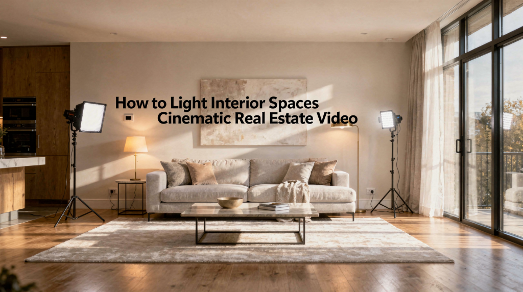
When you walk onto a location, the room is already telling you what it needs. The windows, the paint, the way the furniture catches the afternoon sun—all of that is data. The trick isn’t to overpower it with gear. It’s to listen, then nudge the space toward its best version on screen. That means shaping depth, protecting the window view, and letting the practicals do their job without fighting the color you’re bringing in.
The common impulse is to blast light until every corner reads on the monitor. But a room with no shadow has no dimension. It stops being a place someone would want to walk into and becomes a set. The goal is balance: windows that hold detail, walls that breathe, and just enough shape in the shadows to give the architecture weight.
Why Interior Lighting Matters in Real Estate Video
A property video lives or dies on believability. The viewer may not articulate it, but they sense when a room feels off—too flat, too harsh, or strangely disconnected from the outside world. Your job is to make the space look polished without stripping away its authenticity.
Flat lighting kills texture. You lose the subtle grain of limewash on a wall, the way a plaster cornice casts a soft shadow against the ceiling. Push too far into contrast, and the window blows out into a white portal while the dark-toned cabinetry turns into a black hole. Neither extreme serves the property.
A controlled cinematic look usually comes from three elements working together:
- natural light that has been shaped, not blocked
- soft supplemental sources that fill without announcing themselves
- color consistency across every light source in the frame
Think of it as lighting for shape and material, not just for a usable waveform. A velvet sofa needs to read as velvet. A polished concrete floor needs to reflect just enough to feel cool underfoot. Those textures are what sell the space emotionally.
Start With the Room, Not the Gear
It’s tempting to unload the van and start building the setup you used last week. Resist that. Every room has its own logic, and the first ten minutes on location should be about reading that logic before touching a single fixture.
Look at:
- window size and orientation—north-facing light behaves completely differently from a low western sun punching through a patio door
- wall color and surface reflectivity—a matte dark accent wall eats light, while a glossy white ceiling can bounce unwanted hotspots
- ceiling height—higher ceilings give you room to rig, lower ones force you to think laterally
- dark corners and alcoves that will lose detail if left unattended
- built-in practicals: floor lamps, under-cabinet strips, sconces, pendant clusters
A bright white room with floor-to-ceiling glazing may need nothing more than a passive fill card and careful exposure. Meanwhile, an interior corridor or a windowless bathroom demands intentional shaping. The rooms that challenge me most are the ones with mixed sources—a warm tungsten chandelier competing with cool daylight spilling from a skylight. Those are the spaces where you earn your day rate.
Ask these questions first
- Where is the main source of daylight coming from, and how fast is it moving?
- Which angle gives the best balance of window view and interior detail without sacrificing depth?
- Which fixtures help the room feel alive, and which ones introduce ugly color shifts or harsh pools of light?
- Are there reflective surfaces—glass cabinet doors, high-gloss backsplashes, polished stone—that will catch the source or the camera?
Answering these before you power on a single head is what separates lighting a room for a real estate listing from lighting a scene with intention.
Build the Scene in Layers
I approach a cinematic interior the way a painter builds a canvas: background wash first, then mid-tones, then highlights. Each layer supports the next without overwhelming it.
1. Ambient light
This is the overall base level—the light that already exists in the room. It could be filtered daylight through sheer curtains, a soft ceiling bounce, or the general wash from practicals. The ambient layer should feel even and almost unnoticeable. If it calls attention to itself, it’s too strong.
2. Fill light
Fill is about rescuing detail from the shadows, not eliminating them. I often use a simple 5-in-1 reflector or a small bi-color LED panel dialed to maybe 10–15% output, feathered so it barely kisses the darker side of a sofa or the face of a kitchen island. The audience shouldn’t register that fill is there—they should just perceive a room that feels open and readable.
3. Accent light
Accent draws the eye where you want it. A textured stone feature wall, a sculptural staircase, a reading nook with built-in shelving—these deserve a subtle highlight. A well-placed tube light tucked behind a column or a small focused source raking across a brick wall can add enormous production value without making the room feel staged.
4. Practical light
Practicals are the emotional heartbeat of an interior. A warm table lamp in a bedroom, a row of pendants over a dining table, the soft glow of under-cabinet LEDs in a kitchen—they make the space feel inhabited. But they need wrangling. Household bulbs vary wildly in color temperature and CRI. I carry a selection of consistent LED bulbs in both 2700K and 3000K to swap into key practicals when the built-in ones are fighting the rest of the scene.
A strong interior setup lets natural and practical light carry most of the narrative weight. The supplemental sources are there to quietly support the frame, not to star in it.
Natural Light Is Usually the Foundation
Windows are the most honest architectural feature you can put on screen. They connect the interior to context—the street, the garden, the skyline. When a room has good daylight, I treat it as the lead performer and build everything else around it.
The safest creative approach is to work with the daylight’s direction and quality rather than fighting it. If the sun is too harsh, I’ll wait twenty minutes for cloud cover or soften it with a diffusion panel. If it’s a north-facing room with consistent cool light all day, I’ll match my fixtures to that tone and let the space feel calm and true.
Best practices for daylight
- Shoot when the room receives soft, directional light. Early morning or late afternoon often gives you gentle raking light that defines texture beautifully.
- Open blinds and curtains unless privacy demands or direct sun is creating unmanageable hotspots on the floor.
- Avoid letting a sharp sun patch hit a critical surface—it will clip fast and pull the eye away from the architecture.
- If the exterior view is a selling point, expose so the windows retain detail. You can always lift the interior shadows in post, but you can’t recover a blown-out skyline.
When a window is in the composition, the fundamental challenge is holding detail in both worlds: the interior mood and the exterior environment. That’s less about raw light output and more about exposure discipline.
How to Balance Windows and Interior Exposure
This is where I see newer shooters struggle most. They expose for the sofa, and the window becomes a nuclear bloom. Or they expose for the view, and the room drops into silhouette. Neither looks premium.
Practical approach
- Set your camera exposure for the brightest area of the frame that still needs detail—usually the window view.
- Decide what matters more for this shot: the connection to the outside or the intimacy of the interior. That decision drives how much you push the fill.
- Add light to the room incrementally until the shadow side of furniture and cabinetry feels controlled, not crushed.
- Check your waveform and false color for clipped highlights and crushed blacks. A tiny sliver of pure white on a window frame edge is acceptable; a large block of blown-out glass is not.
If the window view is critical—say, a downtown skyline or ocean horizon—you need enough interior illumination to keep the room readable at that exposure. That may mean a larger fill source or strategic bounce to bring up the ambient level without creating harsh secondary shadows. If the exterior is less important, you can let the windows run a little hot and focus the viewer’s attention on the architecture inside.
Common mistake
Many shooters meter for the room and forget the window entirely. The footage then feels claustrophobic or artificial because the natural connection to the outside is severed. A window that reads as pure white on screen stops being a window.
Better approach
Treat the room and the window as one composition. You’re balancing two environments that must coexist in a single frame. When the balance is right, the viewer senses the outside without being distracted by it, and the interior feels spacious and grounded.
Color Temperature: Keep It Consistent
Mixed color temperature is the fastest way to make a beautifully composed shot look careless. A cool blue window frame next to a warm orange lamp creates a visual tension that cheapens the image, even if the viewer can’t name why it bothers them.
Simple rule
Match your artificial lights to the dominant light source in the room. If daylight is driving the scene, your fill and accent sources should sit around 5000K–5600K. If the room is lit primarily by warm practicals and evening is setting in, lean into 3200K and let the space feel cozy and intentional.
Common choices:
- Daylight-balanced fixtures for sunlit rooms where windows are prominent
- Bi-color LEDs when the scene shifts from daylight-heavy to practical-dominated as you move through the space
- Tungsten-style warmth for rooms lit mostly by table lamps, sconces, and chandeliers
What to watch for
- greenish household LEDs—cheap bulbs with poor CRI that cast an unflattering tint on skin tones and surfaces
- orange lamps that clash violently with a cool window view
- fluorescent fixtures that flicker, hum, or dump a sickly green-magenta cast into the frame
- different color temperatures bleeding between adjacent open-plan spaces, creating a disjointed feel
If you can’t match everything perfectly—and sometimes you genuinely can’t, especially in mixed-use buildings—make one source the clear creative choice and tame the rest. Dial down the output of the offending fixture, flag it, or replace its bulb if the production allows. Consistency reads as intentionality.
The Best Types of Lights for Interior Video
You don’t need a truck full of HMIs to light interiors beautifully. A compact, thoughtfully chosen kit will handle most residential and architectural scenarios. The key is having the right kind of control—soft sources that wrap, bi-color flexibility, and modifiers that shape the beam without adding clutter.
| Light Type | Best Use | Strengths | Limitations |
|---|---|---|---|
| Soft LED panel | General fill and window balance | Compact, dimmable, easy to shape with grids or diffusion | Can look flat if aimed directly without diffusion |
| Bi-color LED | Matching mixed daylight and practicals | Flexible color temperature from warm to cool | Output quality varies significantly by model and price point |
| Light bounced into wall or ceiling | Soft ambient fill | Natural-looking, flattering, wraps around subjects | Needs a neutral-toned surface nearby |
| Practical lamps | Atmosphere and realism | Makes the space feel lived-in | Can introduce color mismatch or harsh hotspots |
| Reflector | Gentle fill | Cheap, fast, naturally soft, no power needed | Limited output; depends on available light |
| Tube light | Tight spaces and accents | Easy to hide behind furniture or in corners, controllable | Can spill into frame if not flagged carefully |
For most interior work, a soft, controllable source trumps a bright hard light every time. Hard light creates sharp shadows that fight the natural feel you’re trying to protect. Soft sources, whether through diffusion or bounce, let the architecture speak without visual noise.
A Reliable Lighting Workflow for Interior Rooms
Over the years, I’ve settled into a repeatable sequence that adapts well across homes, apartments, and architectural interiors. It keeps me from overlighting and forces me to justify every source I bring in.
Step 1: Set the room base
Open the blinds fully, unless there’s a reason not to. Switch on practicals that add warmth and life. Turn off any fixtures that contaminate the image—flickering tubes, mismatched bulbs, harsh overheads that create ugly pools. This is your starting canvas.
Step 2: Choose your camera angle
Look for the position that gives you depth and layers: a foreground element, a mid ground that defines the space, and a background that reveals the window or hallway beyond. Avoid angles that bounce harsh reflections straight back at the lens. The best composition often reveals itself when you walk the room with one eye closed, just watching how the light falls.
Step 3: Establish the main exposure
Set your exposure to protect the highlights you care about. I typically expose so the window view holds texture, then check how deep the shadows have fallen. This gives me a clear brief for how much fill I need and where.
Step 4: Add fill
Bring in a soft source or reflector to lift the darkest areas. Start at minimal output and increase until the shadow detail is present but not gone. If you can see the fill source in the frame’s reflection, reposition it. Subtlety is everything.
Step 5: Check color
Walk the room with your eyes and the monitor. Is there a competing color temperature between the window, the ceiling fixtures, and the light you just added? If the window is cool and your fill is warm, the split will be visible even to an untrained viewer. Adjust your gels or bi-color settings until the room feels unified.
Step 6: Refine shadows
Look at the frame and ask yourself: does this room still have shape? A completely flat interior, where every corner is lifted to the same luminance, looks fake and sterile. Leave intentional shadow under furniture, inside alcoves, and along the edges where walls meet. Those gradients are what give the space three-dimensional weight.
Step 7: Recheck movement
If your shot involves a slider push-in, a gimbal walkthrough, or a slow pan, run the move once with final lighting. A setup that looks perfect static can reveal a hot edge or an unwanted reflection once the camera shifts perspective. Adjust flags or dial back intensity as needed.
Lighting Different Interior Types
Each room has its own personality and its own challenges. What works in an airy living room will fail in a compact bathroom with glossy tile.
Living rooms
Living rooms thrive on soft daylight and layered practicals. I keep contrast gentle—just enough to define the furniture shapes without losing the fabric textures. A floor lamp in the background corner and a soft fill from the shadow side can carry the entire scene. The room should feel like you could sit down and stay awhile.
Kitchens
Kitchens are reflective battlegrounds. Polished countertops, stainless steel appliances, glass cabinet fronts—all of them can catch a light source and throw it straight back at the lens. I use soft, bounced fill almost exclusively here, and I watch the under-cabinet lighting carefully. Those strips can be a beautiful accent or a harsh blue-white distraction, depending on the bulb quality. If the overheads are creating hotspots, I’ll dial them down or flag them rather than fight the reflection.
Bathrooms
Bathrooms punish harsh lighting. The combination of mirrors, glossy tile, and compact dimensions means that a hard source will create a cascade of secondary reflections. Soft, diffused light from above or from the side works best. I often bring the ambient level up with a bounced source and use a small fill to lift the face of the vanity without making the mirror a problem. Color contamination from warm vanity bulbs is common; matching those to the rest of the room saves time in post.
Bedrooms
Bedrooms need calm and dimension. A bright frontal source kills the mood instantly. I lean on warm practicals—bedside lamps, a soft pendant—and supplement with a gentle side or top fill to keep the bedding and headboard readable. The shadows should feel soft, like morning light through curtains, not like an interrogation.
Hallways and transitional spaces
These are the spaces that can go dark and flat fast, especially in older homes with no natural light. Narrow corridors often need the most support. I use small tube lights tucked at the baseboard or bounced into the ceiling to create a continuous visual flow. Practicals like wall sconces are gold here—they provide both light and architectural rhythm. The goal is to make the transition from room to room feel seamless, not like stepping into a shadow pocket.
Practical Examples
Example 1: Bright daytime living room
- Open all blinds and let the daylight set the tone
- Use daylight as the main source—it already wraps the room well
- Place a soft fill source on the shadow side to lift the seating area
- Keep lamps on if they add warmth and balance the color palette
- Expose to hold detail in the window view; the exterior should be readable
This creates a clean, premium look without making the room feel artificially lit. The space looks expensive because it looks honest.
Example 2: Dim kitchen with mixed fixtures
- Turn on practicals that are color-consistent with each other
- Replace or avoid household bulbs that throw ugly green or orange casts
- Use a bi-color LED fill matched to the dominant tone in the room
- Bounce the fill off a wall or ceiling to keep the light soft and indirect
- Watch reflections on counters and appliances; flag as needed
This approach keeps the kitchen readable and inviting without making it look like a product shoot. The viewer should notice the marble, not the light source.
Example 3: Bathroom with no window
- Start with a clean white balance locked to the main fixture temperature
- Use soft overhead control—diffuse the ceiling light if it’s harsh
- Add a small fill source to lift the face of the vanity area
- Avoid hard shadows from mirrors or vanity sconces by feathering the fill
In windowless rooms, consistency and softness carry the entire image. The lack of natural light means every artificial source must work together flawlessly.
Common Mistakes to Avoid
- Overlighting the room until it looks like a furniture showroom—sterile and soulless
- Letting windows blow out without intention, severing the connection to the outside
- Mixing warm and cool sources without a clear creative choice driving the look
- Using hard light that casts sharp, ugly shadows across walls and floors
- Ignoring reflections in mirrors, glass cabinets, stainless steel, and polished stone
- Lighting every corner equally and flattening the space into two dimensions
- Leaving flickering or color-shifting bulbs in frame because you ran out of time to swap them
A room does not need to be uniformly bright. It needs to feel shaped, dimensional, and believable. The shadows are not your enemy—they are the architecture’s voice.
A Simple Interior Lighting Checklist
Before I roll on any scene, I run through this mentally. It catches the issues that are easy to miss when you’re focused on composition.
- Windows are open, controlled, or intentionally managed for the shot’s creative goal
- Practical lights are on only if they help the image—ugly fixtures are off or replaced
- Mixed color temperatures are minimized and any remaining contrast feels intentional
- Shadows still exist, but they aren’t crushing detail in critical areas
- Reflections are checked in all glossy and mirrored surfaces within the frame
- The room feels consistent across the entire camera move—no hot spots or dark pools
- Exterior and interior are balanced relative to the scene’s priority
Quick Decision Guide
| Situation | Best Lighting Approach |
|---|---|
| Large daylight-filled room | Use natural light as the base and add fill only where shadows lose detail |
| Dark room with no windows | Build the scene from scratch with soft artificial sources and practicals |
| Mixed daylight and warm lamps | Match the dominant look and flag or replace the outliers |
| Reflective kitchen | Use soft, bounced fill and reduce direct sources that create hotspots |
| Small bathroom | Keep light soft, controlled, and color-consistent across all fixtures |
FAQ
Should all interior lights be turned on for real estate video?
No. Turn on only the fixtures that improve the scene. Some lights add warmth and realism; others introduce color problems, harsh shadows, or distracting reflections. Be selective and intentional with every bulb in the frame.
Is natural light always better than artificial light?
Natural light is usually the best starting point because it feels authentic and connects the interior to its surroundings. But it’s rarely enough on its own. The strongest results come from natural light supported by soft, controlled fill that respects the daylight’s direction and color.
How bright should interior lighting be?
Bright enough to reveal texture and detail, but not so bright that the room loses its shape. If every shadow disappears, the image flattens and the space loses its architectural integrity. Shadows are what give a room depth and dimension.
What is the biggest mistake in interior lighting?
Ignoring the relationship between the window and the room. When one is exposed properly and the other is left to fail, the entire image feels unbalanced and amateur. Treat the window and the interior as a single composition.
Do I need expensive gear to light interiors well?
No. A soft LED panel, a reflector, and thoughtful placement will outperform a truckload of expensive hardware in inexperienced hands. Control, color consistency, and the ability to read a room matter far more than the price tag on your lights.
Conclusion
Lighting interior spaces for cinematic real estate video is about balance, not brute force. Start with the room’s natural light—that’s your foundation. Support it with soft fill that respects the direction and quality of the daylight. Keep your color temperatures consistent, even if that means swapping a few household bulbs. And preserve enough shadow to give the space depth and dimension.
When the lighting is right, the viewer stops analyzing the image and starts feeling the space. They notice the way morning light moves across the bedroom floor, the warmth of the kitchen at dusk, the quiet elegance of a hallway at night. That’s the real goal: making the architecture feel alive, dimensional, and worth stepping into. Not because you imposed something on it, but because you revealed what was already there.