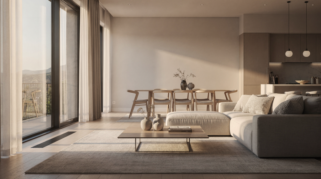
What “cinematic” means in real estate photography
Cinematic real estate photography borrows one fundamental lesson from filmmaking: every visual choice should support a feeling. In a home, that feeling might be calm, warm, expansive, dramatic, or minimal. The photograph still has to sell the space, but it does so with stronger visual character and an emotional undercurrent that makes a viewer pause instead of scroll.
In practice, cinematic images usually share a set of recognizable traits. Controlled light sculpts the room instead of flattening it—shadows become a tool, not a mistake. The composition creates a clear sense of foreground, midground, and background, giving a two-dimensional image the depth of a film still. Vertical and horizontal lines stay deliberate, anchoring the frame with architectural honesty. And small, restrained details—a book left open, a throw draped just so—suggest a lifestyle rather than a floor plan.
The point is never to make a room look unreal. It’s to make the room feel dimensional and worth entering. When you walk onto a set, you decide where the audience should look first. The same thinking applies here: you guide the eye through space, revealing what the property actually feels like to inhabit.
The atmosphere starts before the camera is turned on
Atmosphere isn’t something you add in post. It’s largely decided in the first few minutes on location, when you decide what to reveal, what to leave out, and how much the room needs to breathe. The camera just records those decisions.
Start by asking what the space is trying to say
Every property has a visual personality, and the quicker you read it, the faster your choices align. A mid-century home may want clean lines, warm tones, and low-angle afternoon light that rakes across original wood paneling. A modern penthouse often benefits from contrast, reflective surfaces, and a composition that pulls the city inside as a backdrop. A historic townhouse feels stronger with layered textures and softer side light that traces mouldings and worn stone. A compact apartment usually needs openness, simplicity, and a clear sense of flow between zones.
When you understand that character, you’re no longer just photographing rooms. You’re translating a space into a visual story—one that respects the architecture and the way someone will live there.
Prep the room with restraint
Atmosphere often gets smothered by clutter or heavy-handed styling. Before a single frame is taken, I walk the space and remove anything that breaks the visual rhythm. This isn’t about making the home sterile; it’s about giving the architecture room to speak.
A quick prep checklist I rely on:
- Clear countertops of small distractions—keys, paperwork, random chargers.
- Straighten rugs, pillows, and window treatments so sightlines feel intentional.
- Align furniture so the arrangement leads the eye naturally into the room.
- Replace mismatched bulbs with consistent color temperatures wherever possible.
- Open blinds and curtains to shape natural light, not just let it flood in.
- Turn on practical lights only when they contribute to the mood.
- Check mirrors, glass, and reflective surfaces for unwanted reflections—a stray tripod or a light stand can quietly kill a frame.
Small corrections compound. A crooked lamp or a visible cable pulls attention away from the feeling you’re trying to build. The best prep leaves nothing to apologize for later.
Light is the main storytelling tool
If cinematic real estate photography has a foundation, it’s light. Standard listing photos often chase bright, even exposure, but mood usually lives in more intentional decisions. Light tells the viewer where to look, how the surfaces feel, and what time of day the room longs for.
Natural light creates realism and softness
Window light remains the most reliable source for a believable, inviting interior. Many experienced architectural photographers work with natural light alone, while others blend it with practicals or subtle fill. The right choice depends on the room’s orientation and the atmosphere you’re after.
Natural light works best when you open curtains and blinds fully, shoot during periods of stable daylight, and avoid harsh direct sun blasting straight into the lens. You want the windows to define the space, not overpower it. Midday is often practical because it delivers steadier light, but morning or late afternoon can give a room shape and tonal softness that feels more editorial. The best time is whichever one gives the room dimension without turning the windows into featureless white holes.
For exteriors, I’ll often wait for the low angle of golden hour or the quiet glow of twilight. That kind of directional light pulls texture out of facades—brick, stone, metal panels—and gives a building weight. The same patience applies indoors: a beam of afternoon light moving across a wooden floor tells a story all by itself.
Practical lights add warmth and life
Interior lamps, sconces, and pendants make a property feel inhabited rather than staged. They also prevent the “empty showroom” effect that happens when every artificial source is switched off. I treat practicals as supporting characters: they should reinforce the room’s character without stealing the scene.
A rule I follow is to use practical lights only when they support the mood and to turn them off when they create color problems or visual clutter. Matching bulb color temperatures is one of those small details that separates a polished image from a messy one. If one lamp casts a warm 2700K glow and another leans green or cool, the room instantly feels unsettled. I carry a small kit of consistent bulbs and swap out the outliers before shooting. It takes five minutes and saves hours of correction later.
Supplement light carefully
Flash and strobes can help balance a difficult interior—especially when the room is noticeably darker than the view outside—but the key is to keep added light subtle. The moment the viewer notices the source, the mood fractures.
Good supplemental light should fill shadows without flattening the scene, feel like it belongs to the room, and avoid obvious hotspots or harsh reflections. I rarely point a strobe directly at the scene. Instead, I’ll bounce it off a neutral wall or ceiling, or place a small LED panel with a soft diffuser just out of frame to lift a dark corner. The goal is always to make the room look the way it felt when you first walked in.
Exposure choices that support atmosphere
A cinematic image still demands technical discipline. If exposure is careless, the mood collapses into blown highlights, muddy shadows, or distracting noise that erodes the sense of place.
Favor depth of field
For most real estate interiors, I work with a smaller aperture to keep the entire room readable. A common range is around f/7.1 to f/9, which provides enough depth of field without sacrificing sharpness to diffraction. The viewer wants to understand the layout and appreciate textures from the foreground rug to the back wall. When the foreground falls too soft, rooms can feel smaller and less intentional. Architectural lines need consistency across the frame, and a broad depth of field helps deliver that.
Keep ISO low
Lower ISO means cleaner files and better preservation of fine texture—wood grain, plaster, fabric, metal. In interior work, noise often reads as a lack of polish, making even well-designed rooms feel darker and rougher than they actually are. A tripod lets me stay at base ISO and use whatever shutter speed the light demands.
Use shutter speed as needed
On a solid tripod, a two-second exposure is no risk at all. That freedom matters in interiors where available light can be frustratingly low, and it opens up the option to keep ISO at its cleanest setting while still stopping down for depth.
Bracket when the dynamic range is too wide
Large bright windows almost always create an exposure gap between the interior and the view. Bracketing is one of the simplest tools to manage it. I capture multiple exposures—sometimes three, sometimes five—so I can preserve detail both on the sofa and in the sky. The images are blended later by hand, not pushed through an automated HDR process, which keeps the result feeling natural.
Bracketing is especially useful when the room has floor-to-ceiling glass, reflective surfaces, or a desirable outdoor view that needs to remain visible. Without it, you either lose the interior to shadow or blow the windows into white oblivion.
Composition: how to make the space feel cinematic
Composition is where the room becomes a scene. A well-composed interior does more than show dimensions. It creates order, depth, and a subtle invitation to move through the frame.
Use clean verticals and straight horizons
Architectural photography depends on geometry. Slanted vertical lines immediately make a space feel unstable or carelessly shot. I always check that walls remain vertical, horizons are level, and door frames or cabinets don’t lean unnaturally. This is especially important in spaces with strong symmetry or clean modern design, where even a slight tilt undermines the precision the architect intended.
When necessary, I’ll use a tilt-shift lens or correct perspective in post, but good camera placement does most of the work. Shooting from a height where the sensor plane stays parallel to the primary wall keeps lines straight from the start.
Create depth with layers
A flat room feels less engaging than one with visual layers. Placing a subtle element in the foreground, letting the midground carry the main subject, and including a background detail that completes the scene mimics the way the eye explores space in real life.
Ways I build depth: shooting past a doorway while keeping part of the doorframe in the frame as a natural border, including the edge of a sofa or table without letting it dominate, using architectural lines to guide the eye inward, and framing through openings like an arch or a hallway. A layered composition feels more cinematic because it rewards a second look.
Shoot from the right height and angle
Camera height changes the emotional tone of a room. Too low, and the space may feel distorted or heavy. Too high, and it can feel detached, like a surveillance shot. A practical starting point is chest to eye level, with the camera kept level to avoid keystone distortion. Angles that reveal depth without exaggerating proportion are usually the strongest.
The best angle is the one that makes the room feel spacious without lying about its proportions. I avoid ultra-wide perspectives that stretch corners just to fit everything in. Often, pulling back slightly and choosing a natural viewpoint tells a calmer, more immersive story.
Table: Choosing the right look for the space
| Space type | Best mood | Lighting approach | Composition focus |
|---|---|---|---|
| Modern condo | Clean, elegant, restrained | Soft daylight with controlled practicals | Strong lines, symmetry, reflections |
| Family home | Warm, inviting, livable | Natural light plus warm lamps | Comfortable sightlines, layered furnishings |
| Historic property | Rich, textured, timeless | Side light and subtle contrast | Details, symmetry, architectural character |
| Luxury listing | Premium, calm, spacious | Balanced light with careful highlights | Expansive angles, depth, minimal clutter |
| Small apartment | Open, airy, functional | Bright natural light and limited practicals | Flow between zones, efficient framing |
Camera movement can influence still photography decisions
Even when shooting stills, thinking like a cinematographer sharpens your eye. When I plan a video walkthrough—a slow slider move along a façade or a dolly into a living room—I’m forced to notice exactly where the light changes, where the room opens up, and where the strongest reveal happens. That same analysis informs a still frame.
Before pressing the shutter, I ask: what would someone notice first if they stepped into this room? Where does the eye travel next? Which corner gives the best sense of depth and flow? What element anchors the scene? Answering these questions pushes me toward compositions that feel discovered instead of documented. The stillness of a photograph can still carry the rhythm of a well-choreographed camera move.
Common mistakes that kill atmosphere
A technically correct image can still feel flat. The mistakes that sap mood are often small, repetitive, and fixable on location.
- Over-lighting until every shadow disappears—rooms need shadow to feel three-dimensional.
- Mixing bulbs with different color temperatures, creating a disjointed, uneasy palette.
- Shooting too wide and stretching the space unnaturally; a 12mm lens used carelessly distorts the truth of the room.
- Ignoring reflections in mirrors, windows, and glossy surfaces that catch gear or the photographer.
- Leaving distracting decor, cables, or stray objects in the frame.
- Overediting until the image feels plastic—heavy clarity sliders and aggressive HDR rob the space of tactility.
- Chasing brightness instead of mood; not every room needs to read as “bright and airy” regardless of its actual character.
The most common error is trying to make every room look the same. Cinematic real estate photography succeeds because it responds to the space instead of forcing a preset style onto it.
A practical workflow for creating atmosphere
On location, I follow a sequence that turns atmosphere from an abstract idea into a repeatable result:
- Walk the space and identify where natural light lands best.
- Decide what mood fits the property—not the mood you wanted beforehand.
- Prep the room by removing distractions and aligning decor.
- Set exposure for the scene, not just what the meter says.
- Test one frame with practical lights on and another with them off to see which supports the mood.
- Check every window, corner, and reflective surface for issues.
- Adjust height and angle to improve depth and straighten lines.
- Bracket if the dynamic range exceeds what a single exposure can hold.
- Review for straight verticals, balanced contrast, and consistent color temperatures.
- Edit with restraint so the final image still feels like the room you stood in.
Editing: where atmosphere is refined, not invented
Post-production enhances what was already captured; it shouldn’t turn the room into something it never was. I treat editing like the final grade on a film—decisive, but invisible.
Keep contrast controlled
A subtle S-curve adds shape, but too much contrast crushes shadows in furniture and makes interiors feel heavy. Too little leaves the image lifeless. I often pull the black point up just enough to retain detail in dark wood or fabric while keeping the overall contrast natural.
Balance warmth carefully
Warm tones can make a home feel inviting, but oversaturated warmth quickly looks artificial. I target a white balance that respects the dominant light source and then make small, selective adjustments rather than heating the entire frame.
Preserve texture
Wood grain, plaster, fabric, stone, and metal all carry tactile information. Heavy-handed noise reduction or global sharpening strips that away. I often use masked clarity adjustments—lifting texture on a brick wall while leaving skin tones or soft furnishings untouched—so the materials read as true to life.
Avoid the “HDR look”
Aggressive tone mapping produces halos, unnatural saturation, and a plastic finish. Instead, I manually blend exposures when needed, painting in detail from a darker frame for windows and a brighter frame for shadows. The result is a room that feels bright and readable, not processed.
When atmosphere matters most
Cinematic real estate photography isn’t always necessary; simple documentation has its place. But it becomes indispensable when a property has something to express beyond square footage—architectural character, historic detail, premium materials, a specific design aesthetic, or a lifestyle appeal that a buyer needs to feel emotionally. In those cases, atmosphere shifts from a nice-to-have to a competitive advantage. An image that makes someone imagine themselves having coffee by the window is worth more than ten that just prove the room exists.
Quick checklist for cinematic interiors
- The light source feels intentional, not accidental.
- Window exposures are under control, retaining detail where it matters.
- Vertical lines are straight and horizons level.
- The room shows depth through layered composition, not just width.
- Practical lights reinforce the mood without creating color conflicts.
- Color temperatures are consistent enough to feel natural.
- Distractions have been removed from the frame entirely.
- The edit preserves texture, realistic contrast, and a sense of place.
FAQ
What makes real estate photography look cinematic?
Cinematic real estate photography uses controlled light, layered composition, and subtle contrast to create a specific mood while still showing the space clearly. It borrows from filmmaking the principle that every visual decision should serve the feeling of the place.
Should all interior lights be turned on?
Not always. Turn on the lights that help the room feel warm, balanced, and true to its character. Avoid mixing bulbs with clashing color temperatures, and don’t be afraid to leave some lights off if they add visual noise rather than atmosphere.
Is natural light always best?
Natural light is often the strongest starting point because it renders materials faithfully and feels instinctively believable. But some rooms need well-judged supplemental light or carefully chosen practicals to feel complete and readable.
How do I make a small room feel atmospheric?
Use clean framing, simple styling, soft daylight, and a composition that emphasizes depth rather than trying to force a wide, distorted view. Even a small space can feel expansive when the light and lines guide the eye calmly through it.
What is the biggest mistake in cinematic real estate photography?
Overediting. When an image is pushed too far—excessive clarity, aggressive HDR, unnatural saturation—the room stops feeling like a real place. The most powerful edits are the ones you don’t notice.
Conclusion
Cinematic real estate photography is the art of making a space feel as good as it looks. When you combine thoughtful lighting, disciplined composition, and editing that respects the material world, a property stops being a listing and becomes a place with presence.
The strongest images don’t just document rooms. They create an invitation, hold attention, and let the viewer imagine themselves living inside the frame. That’s what atmosphere does, and that’s the difference between a photograph that gets glanced at and one that gets remembered.